GSoC - My project's code submission

Hello, I’m Mateus Jabour, I’m student on Federal University of Paraiba, and since I am passionate for front-end, I really liked the project’s idea. The initial project’s idea was just to update the bootstrap on the HTML files to the newest stable version(v3.3.6), but, my will was to make more than just this, and my proposal was to redesign the whole website and make it responsive, and that was what I did. In this post, I will describe some things that I changed.
Changes
Homepage
On OpenSNP, we have two different homepages, the users homepage, and the “first time” homepage, I will talk about this “first time” homepage. So, why I gave this name to the homepage? Because the function of this homepage is just to introduce the whole application. Let’s see the old version of the “first time” homepage:
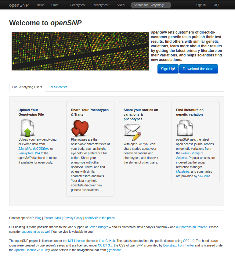
When I first looked this homepage, one thing that bothered me was the fact that the whole information wasn’t there for me, I needed to click something to have more information about the website. For a better introduction, I tried to make this homepage the simpler as I could, without buttons and things to discover, let’s have a look:
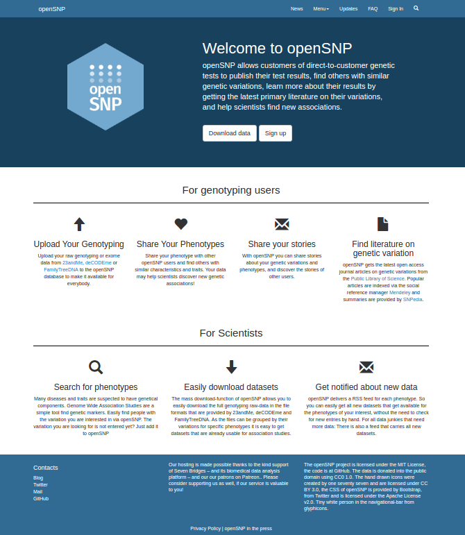
As you can see, I tried to make the homepage more continuous, without pages or tabs, so the user needs just to roll down the page and read the website summary. This way the user doesn’t spend a lot of time or just give up of reading it because looks hard to do it.
The user’s homepage also changed a lot, if you give a look at the old user’s homepage, you can see that the informations about the user wasn’t so clear, you couldn’t identify easily the elements on this page, I tried to make it more beautiful and organized, let’s have a look at both:
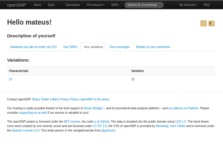
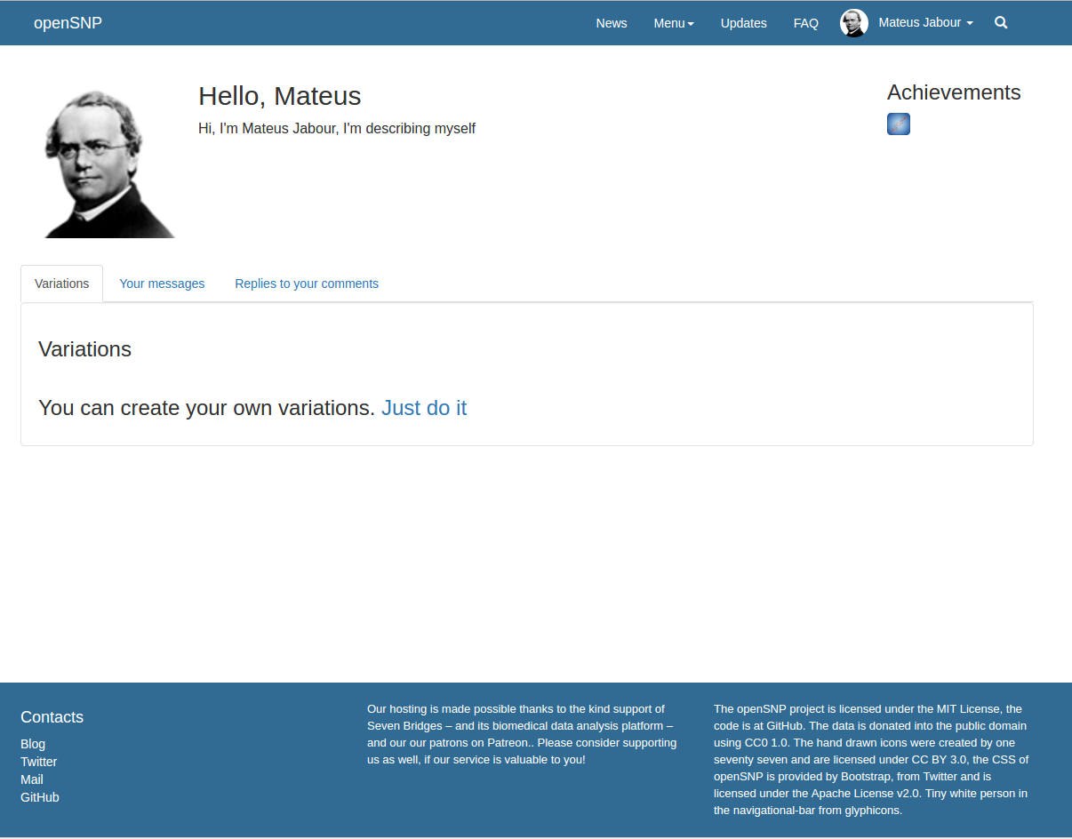
You can notice that, on the navbar, the dropdown “My account” on the old homepage also changed to a dropdown with the profile photo and name of the current user, letting cleaner that the user is logged. Also, the profile photo creates a section of “user personal informations”, separating them from other informations.
Navbar
The navbar is a main feature, it’s the only way for the user to access almost everything from the website, so, it’s important to have it clean and easy to understand. Comparing the old navbar with the new can be very interesting to highlight some points.


As you can see, the navbar’s older version was a little bit full, with a lot of options and a search input in the middle. In order to make the navbar cleaner, I wrapped a few options in one dropdown, I transformed the search input into a button that brings the search input when you click the button.
Responsivity
As I said on the beginning, my proposal was to make this website responsive, and I made it using media queries with two different breakpoints, one for mobiles(321px) and other for tablets(769px) and also using mobile first design. This’ important so we can reach a lot of people regardless of their device. I will show you examples of responsivity on this website. The two examples will be the two homepages, let’s give it a look:
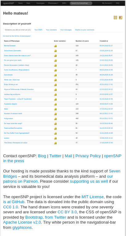
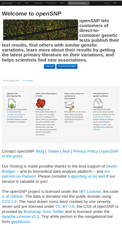
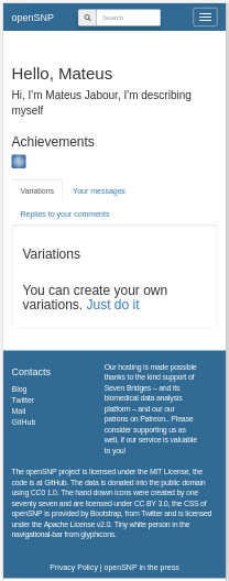
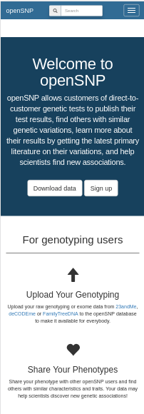
You can notice that, the old version wasn’t responsive at all, it decreases the size, but doesn’t change. Two changes that you can see are: The navbar collapses on responsivity, and the images aren’t showing. This way we make the website lighter for people who are using mobile internet.
Code
One goal that I had in my mind since the beginning of the project was to make the code the most readable I could make: indentation, organization, classes’ names, everything very clear, so anyone can read the whole project. On CSS, I established an order of properties(I mentioned it on the project plan), and I followed a pattern for writing classes name. You can see some of the code changes on the github repository: Repository. You can acess the branch “dev-html” or “dev-js”, and you’ll see the changes.
So, I really would like to thank my mentors Phillipp Bayer and Bastian Greshake for all the support and teaching during these three months. Also, I would like to thank my partners Vivek Rai and Graham Dyer for the help that they could offer me. The experience of working on this project was fantastic, I learned a lot with everyone envolved, I would like to thank the whole OpenSNP for this.